 W-2 Wage Distribution by Tax Bracket & Gender [OC]
Submitted by takeasecond t3_10t6t4r in dataisbeautiful
tipjarman t1_j76d719 wrote
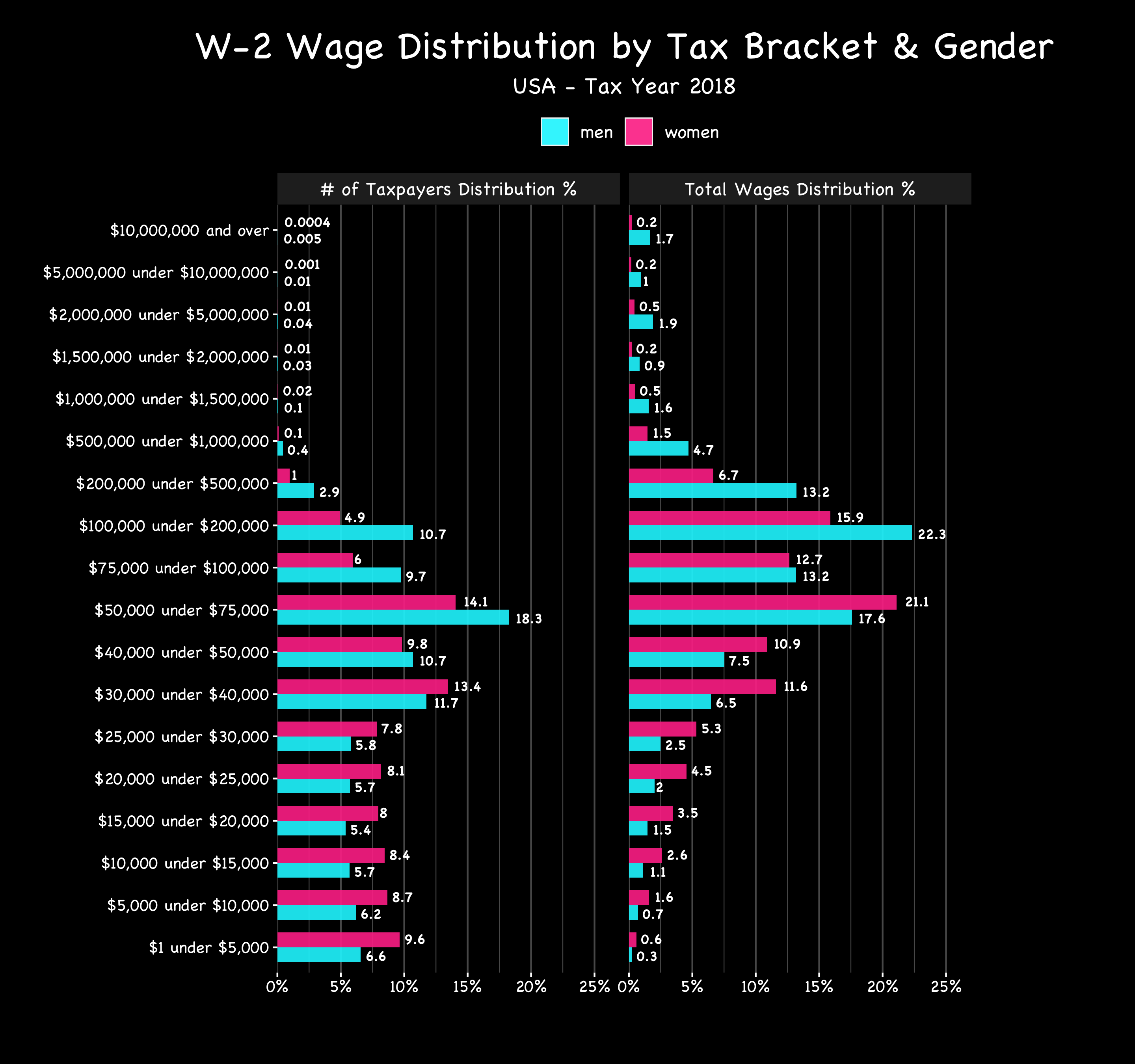
Trying to interpret this. So column 1 is telling me that (for instance) that 18.3% of taxpaying men make between $50k - $75k right? And 14.1% of taxpaying woman.
Then the second column is wage distribution. So that same row ( $50k - $75k ) has wage distribution for woman at 21.1% and men at 17.6.
Whats the best way to understand this?
amiable_amoeba t1_j771idt wrote
I think "total wages" is "what percent of w-2 wages are in this range".
So sum every male w-2 in the bucket, then divide by total male w-2 wages.
So while 0.0004% # males in highest bucket, it accounted for 0.2% of all male money earned.
tipjarman t1_j775urd wrote
I think you mean FEMALE money earned in highest buckets but i get your drift. Interesting. So what information does this graph tell me?
fighter_pil0t t1_j7a751m wrote
Pink is women.
-Motor- t1_j7ii1zi wrote
I don't think it's telling us much more than that. It's just data regurgitated into a graph. You'd have to aggregate it further to make talking points. I take that further inference isn't the intent since it is so disperse.
tipjarman t1_j7ims02 wrote
Well, it kind of appears to be telling us some thing about wages between men vs women, over a bunch if different tiers of wage categories. But i cant figure out the “what” here.
Viewing a single comment thread. View all comments