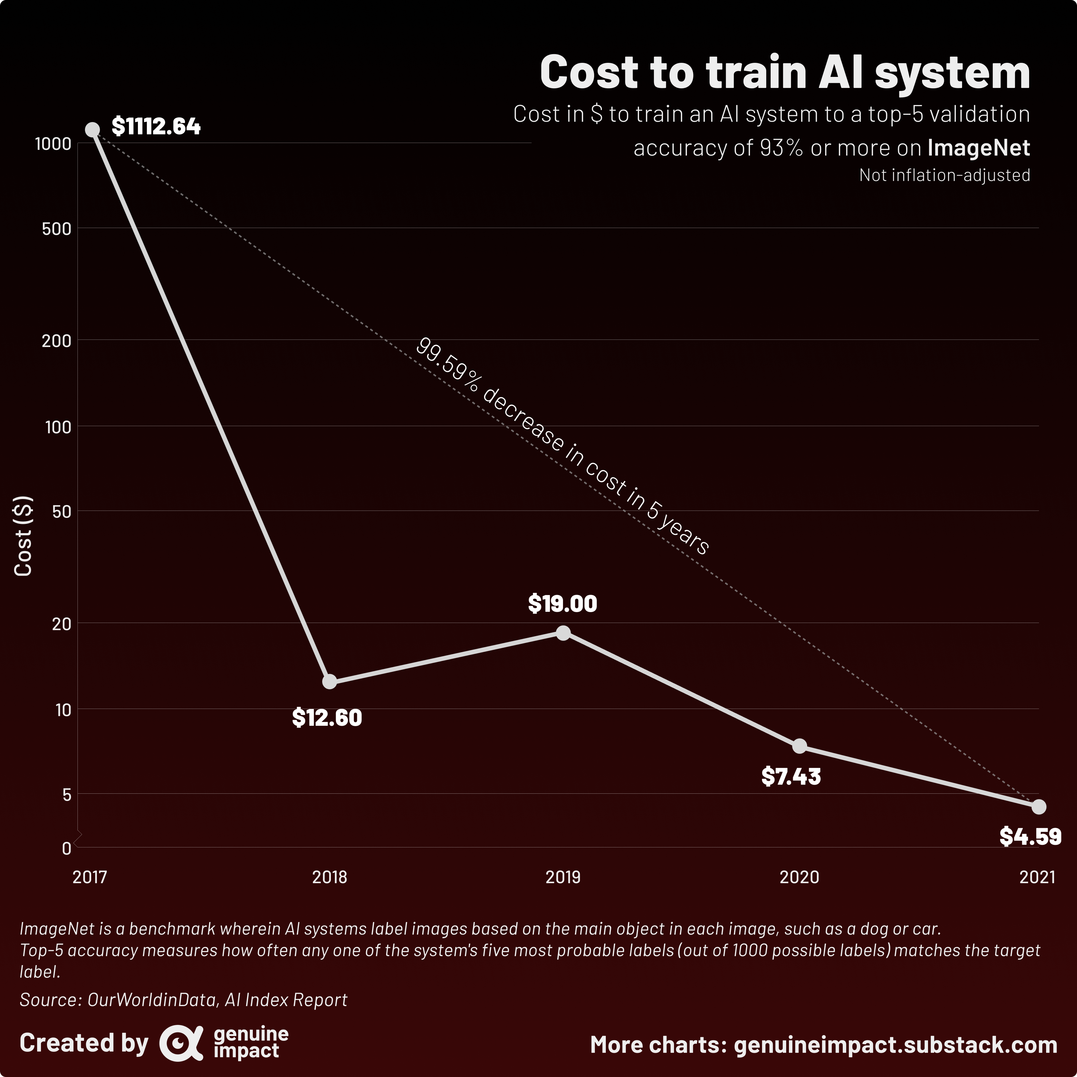
 [OC] The cost of training AI on ImageNet has decreased from over $1000 to just under $5 in just 4 years
polanas2003 t1_j8wvpq1 wrote
Reply to comment by viridiformica in [OC] The cost of training AI on ImageNet has decreased from over $1000 to just under $5 in just 4 years by giteam
Well it is a trade-off of either seeing the big drop and nothing else or seeing the big drop and due to the log level graph also seeing the further advancements clearly.
That's what I was always taught to do to provide a better glimpse of data in statistics and econometrics classes.
Whiterabbit-- t1_j90bp8z wrote
the further advancements are irreverent. of the 4 dat a points one goes backwards, and the cost only decreased by 50% compared to the drastic cost the year before.
viridiformica t1_j8wx27r wrote
If this were in a scientific publication where seeing the actual numbers in each year was important, I might agree. But this is a data visualisation purporting to show the trend in costs over 5 years, and it is failing to show the main trend clearly. It's the difference between 'showing the data' and 'showing the story'
Viewing a single comment thread. View all comments