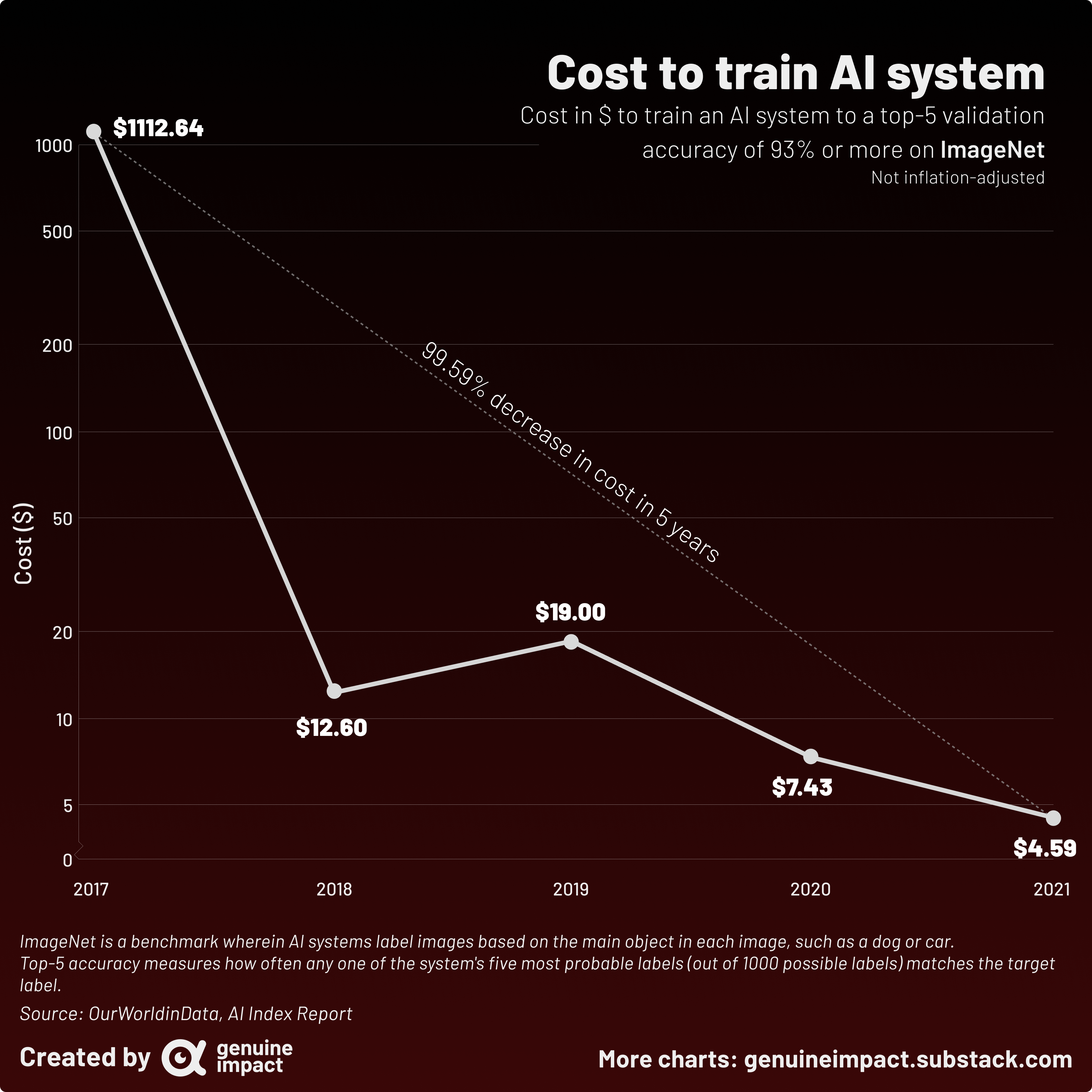
 [OC] The cost of training AI on ImageNet has decreased from over $1000 to just under $5 in just 4 years
ChronWeasely t1_j90b0of wrote
Reply to comment by Utoko in [OC] The cost of training AI on ImageNet has decreased from over $1000 to just under $5 in just 4 years by giteam
The "trend line" with the attached conclusion is what makes it egregious and masks the logarithmic nature of the y axis. Like it misses the important points with overfitting.
And the interesting thing is two things
- in one year, prices fell by 99%
- in subsequent years, prices have fallen another 60%
But it makes it look like there is a continuity that in reality doesnt fit a trend line at all as is seen in the non-logaritmic version
Viewing a single comment thread. View all comments