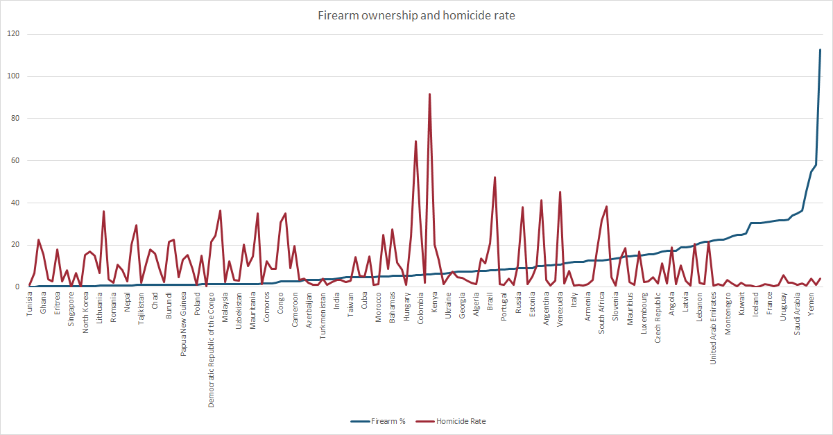
 [OC] Firearm availability compared to homicide rates around the world
Submitted by blizzard36 t3_11558uw in dataisbeautiful
toyrobotics t1_j90rg4t wrote
On the x-axis, the furthest left country names are Tunisia and Ghana. But the red line appears to show four data points in the same space. I believe this is because your chart configuration automatically omitted every other name due to overcrowding of the labels on the x-axis. If I’m right, that means you have unlabeled data points.
Also, you have sorted according to one value (gun count — per capita?). But a scatter plot seems like a better way to show the (purported?) lack of correlation.
Viewing a single comment thread. View all comments