 How the US and Canada Reduced Their Power Sector Emissions: Top Source of Electricity in Each State and Province Since 2005 [OC]
nkj94 t1_ja8otol wrote
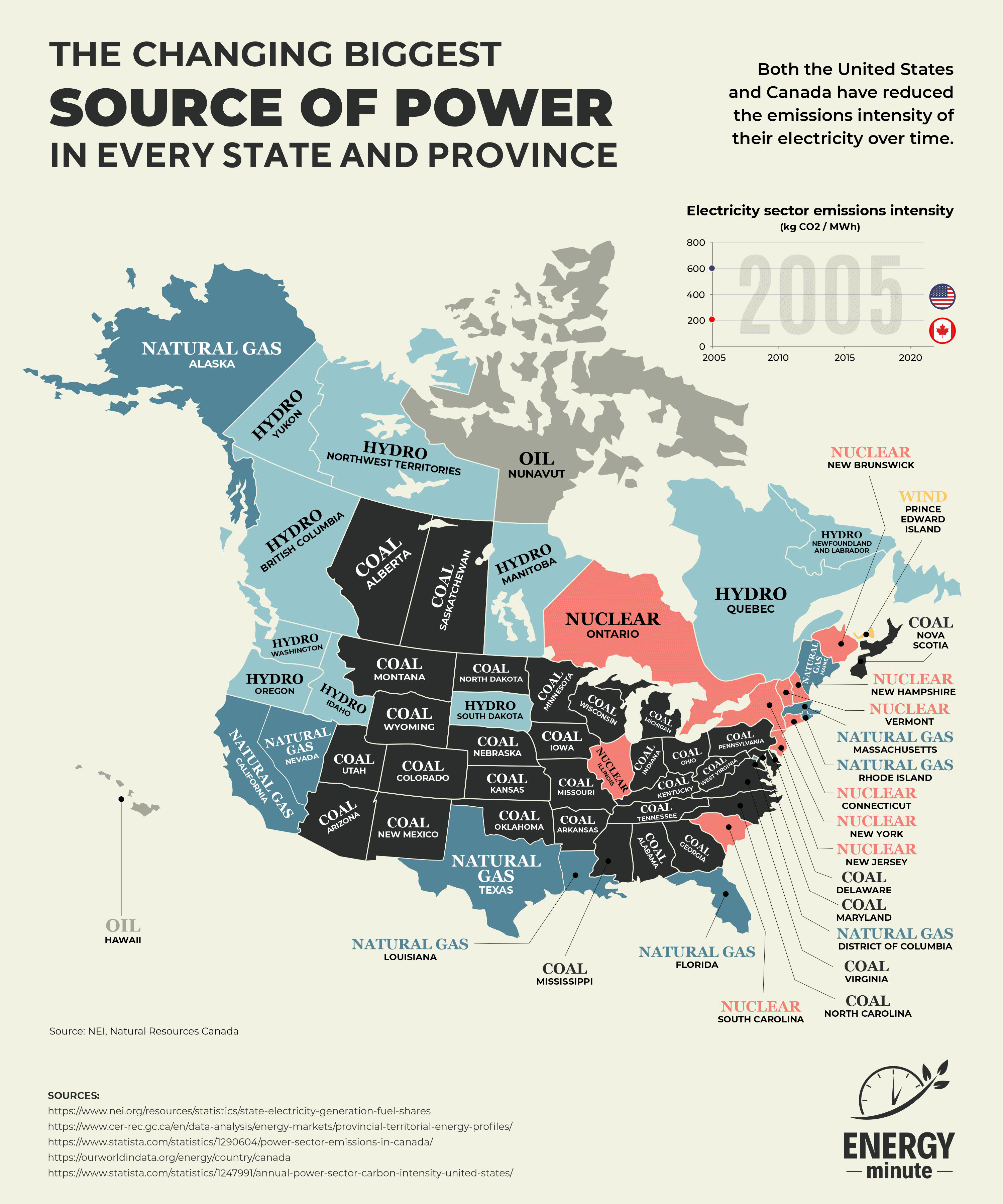
Why you color Natural Gas Blue and Nuclear orange
is this some kind of propaganda?
squickley t1_ja8snqw wrote
I caught that, too. It makes hydro and gas look related somehow. Coal and oil are black and grey, for comparison.
A better colour scheme would change: dark blue hydro, light blue wind, yellow nuclear, coral gas.
backgamemon t1_ja8z3h0 wrote
Probably (hopefully) just a random colour scheme that is not too great.
Viewing a single comment thread. View all comments