Submitted by Ok_Acanthisitta5799 t3_11g803e in dataisbeautiful
Submitted by Ok_Acanthisitta5799 t3_11g803e in dataisbeautiful
My data visualization professor showed us this in a lecture when I was in school for cs. Loved that class.
Wow, Do you have the visualisation output from that?. Will be good to see.
[removed]
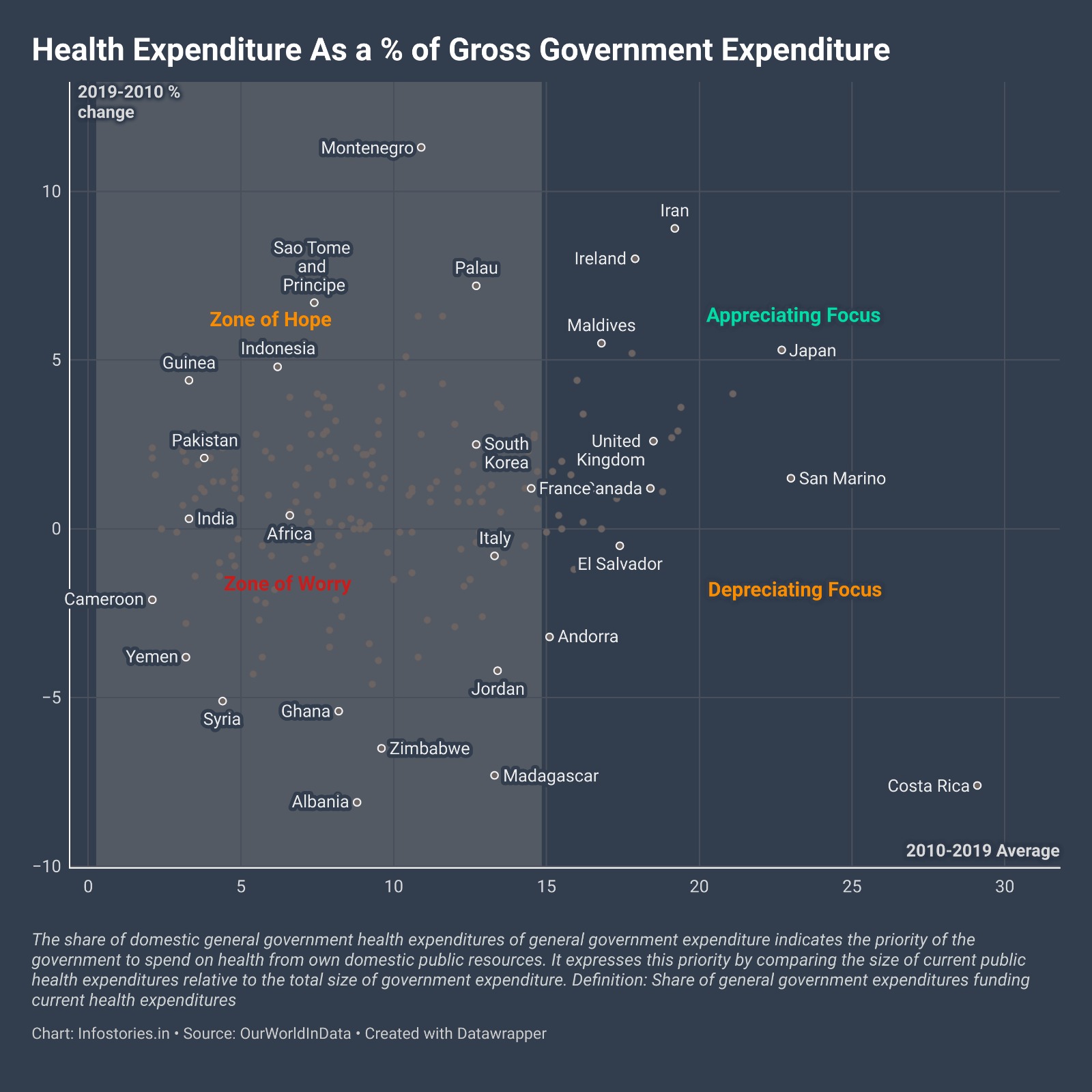
How did you decide which countries to highlight?
Just the polars on the chart that are significant. The interactive chart is supposed to give all details on hover.
No, he was just showing the visualization it self (a similar one) to analyze methods for "telling a story through data".
We also watched this as optional extra material https://youtu.be/6xsvGYIxJok
Wait, I actually found it in my old notes lol. I was wrong. It was very similar, but it was life expectancy vs average income by country, and it was animated by year, where each node had a radius based on population.
Pretty close to this, but slightly different
I don't agree with the positioning of "zone of worry" and "depreciating focus" in specific, as they are too close to 0% in Y axis. For example San Marino seems to be in the middle between appreciating and depreciating, while in actuality it was already one of the top spenders and it even raised (even if not much) their spending, I'd say the label should be placed further down
Idk, you list Africa which is a contintent, then list Ghana and Zimbawe seperately. Gonna assume you meant North of South Africa?
Ok_Acanthisitta5799 OP t1_jan6vhe wrote
https://datawrapper.dwcdn.net/jiiQA/1/ (for interactive use)
Made with Datawrapper using Ourworldindata source.