 [OC] All-Time Deadliest Accidents and Disasters vs. One Year of Traffic Deaths
Submitted by databeautifier t3_11ij5le in dataisbeautiful
Gloomy-Advertising59 t1_jazpuvj wrote
Reply to comment by JetstreamFox in [OC] All-Time Deadliest Accidents and Disasters vs. One Year of Traffic Deaths by databeautifier
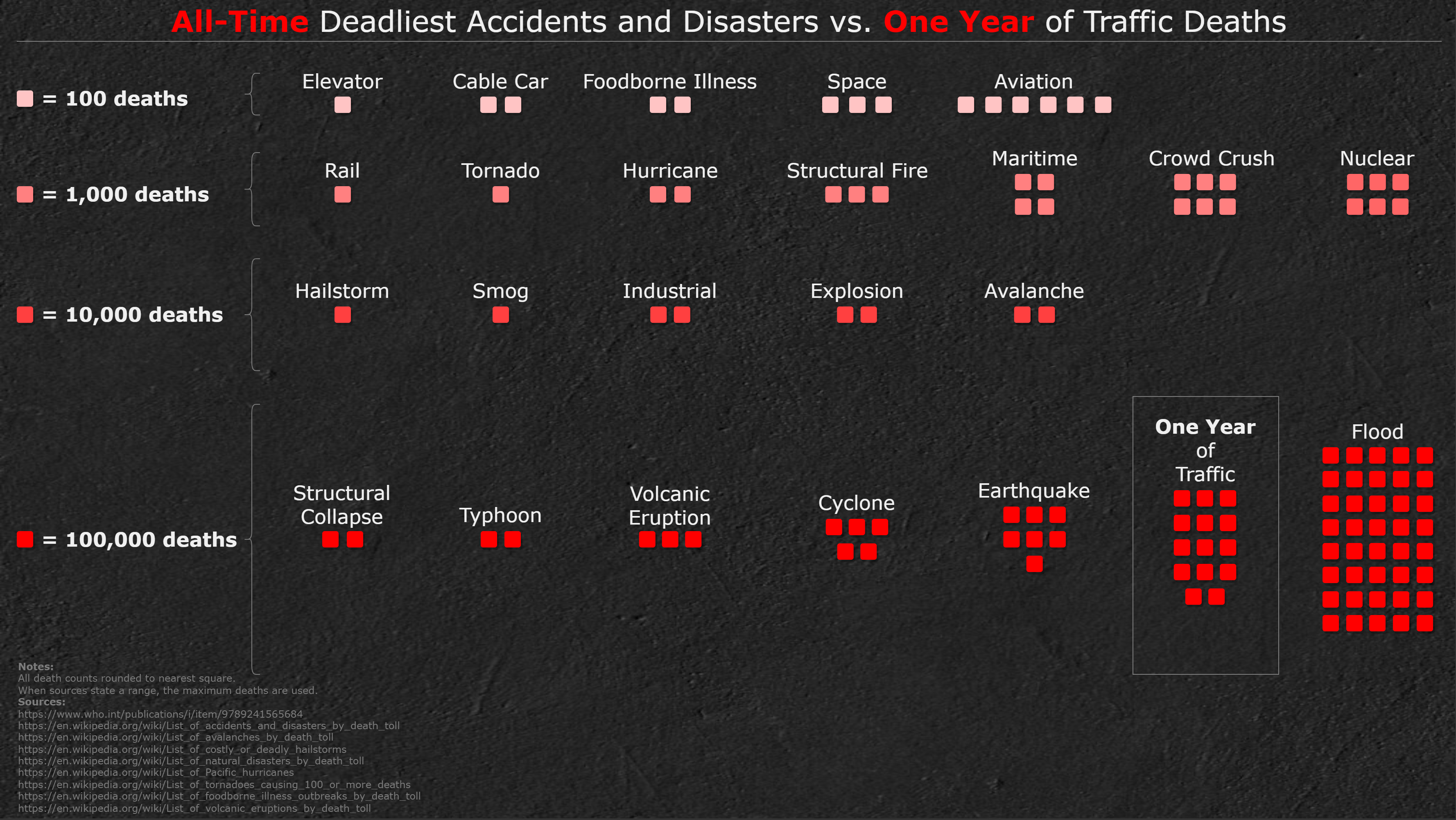
Read the title. The graphic is comparing the worst single accidents (i.e. the 1977 disaster for aviation) with annual traffic deaths.
JetstreamFox t1_jazsiyb wrote
Well, ok. Should’ve taken the extra seconds for reading. Anyway I’m proud of my memory, as I hadn’t to google that accident.
soundisloud t1_jb06zv7 wrote
Really not your fault, it's a confusing graphic. Because ALL TIME and ONE YEAR are highlighted, it really sets you up to think this is comparing all aviation deaths ever.
Viewing a single comment thread. View all comments