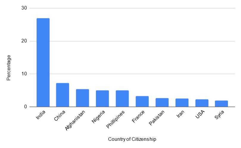
 [OC] Canada’s top 10 Sources of Immigration by Country of Citizenship in 2022
Submitted by datasciencerookie t3_11j5qof in dataisbeautiful
[deleted] t1_jbe6d13 wrote
Reply to comment by datasciencerookie in [OC] Canada’s top 10 Sources of Immigration by Country of Citizenship in 2022 by datasciencerookie
Not but treemap would be nice. Same with pie chart, showing percantage. But pie chart is hard to be recognized if not distribution is like 25-50-75%
Viewing a single comment thread. View all comments