 My Weight (lbs.) From Age 17-31 [OC]
Submitted by Emergency_Fox3615 t3_11kf51i in dataisbeautiful
almostcorey t1_jb70jwu wrote
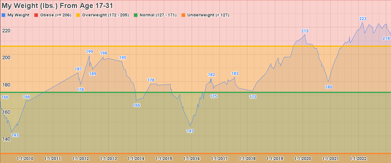
I like the indications of BMI brackets. Height would be a good thing to add, though based on the brackets I can tell you're approximately 5'10. I'd have preferred to see age on the X axis instead of year. I think this is an effective way to present the data -- styling could improve beauty, though that is not my forte. If there were relevant events (e.g. started a diet) you could add those to the timeline.
Emergency_Fox3615 OP t1_jb721z4 wrote
Now I remember what I forgot. I’ll add height and sex to my top level comment (31M, 5’ 9.5”).
I also thought age would be better than the date but I couldn’t get the axis labels to be more frequent than every 2 years which I didn’t like so stuck with date.
Definitely agree it could be improved visually. I’d normally make such a visual in Excel which is more robust than G Sheets but I’m currently in between jobs and not paying MS for an Office license on my personal laptop so I did what I could.
Thanks for the feedback!
almostcorey t1_jb730cl wrote
I think every two years would still be preferable, though yearly should be possible.
Emergency_Fox3615 OP t1_jb7b6kh wrote
I looked at this again. I was misremembering the issue. I was able to make age work but it then it screwed up my data labels (weights) on the main line. I'd have needed to reset to having the full set of 246 labels, tediously deleting most of them to keep the clean look. But here's what that looks like with age, just without the data labels on the peaks/ valleys.
almostcorey t1_jb7bauk wrote
If that's true then you should find some better software.
Viewing a single comment thread. View all comments