 Location Data : US Zip Codes : [OC] Source: USPS Tool: Tabreau
Submitted by tonyk999 t3_yoi8v2 in dataisbeautiful
barrycarter t1_ivedy93 wrote
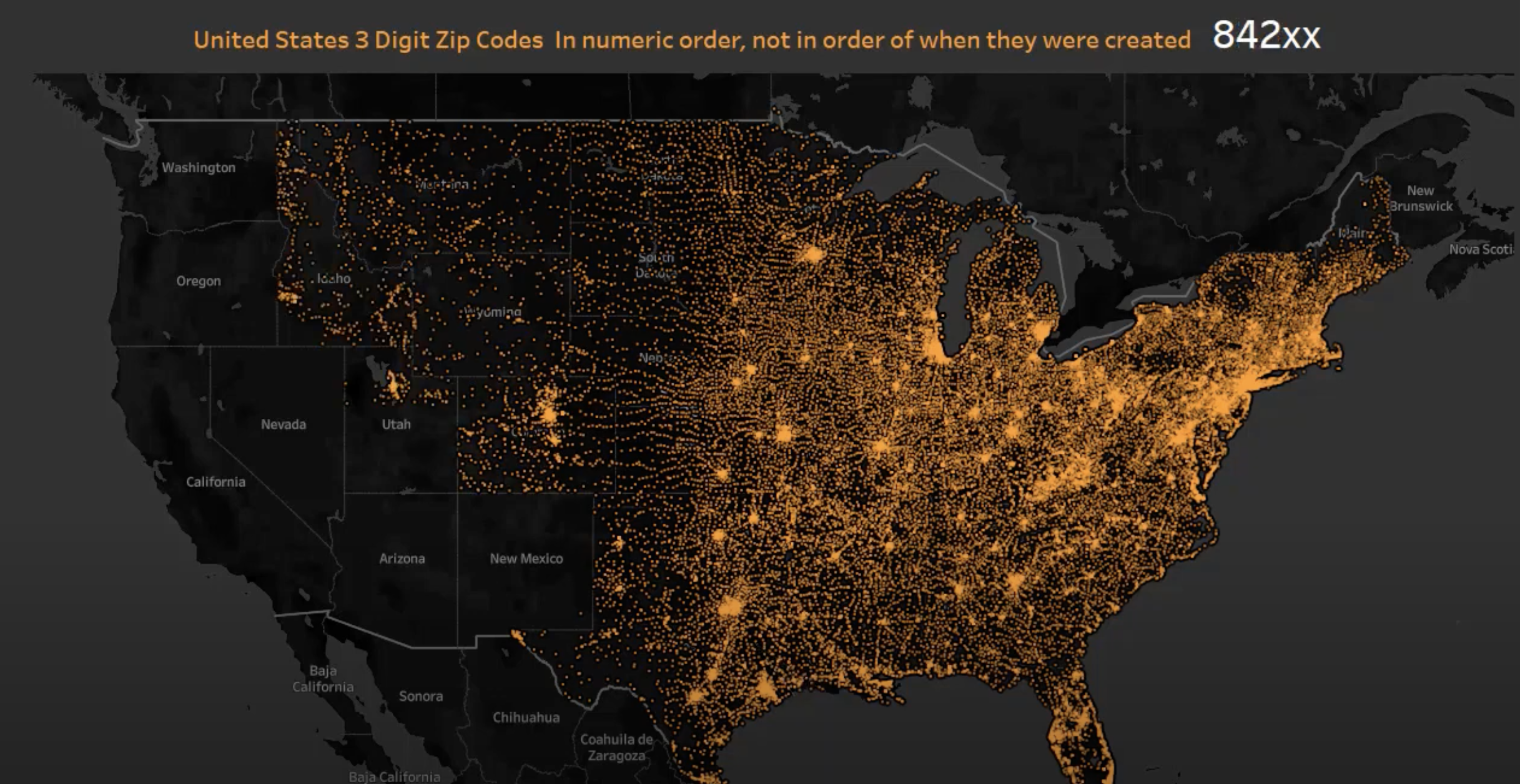
As https://xkcd.com/1138/ notes, most maps like this look similar to population density maps. What might be REALLY interesting is to "divide" this map by population density or do something like "number of people served by a given zipcode", which should have some variations that don't look like a population heat map
Viewing a single comment thread. View all comments