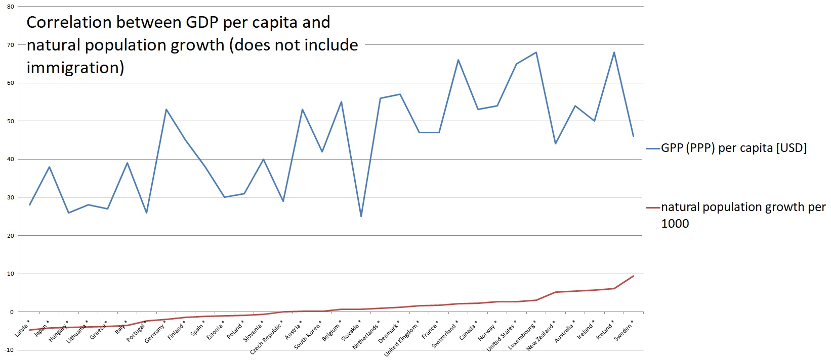
 [OC] Correlation between GDP per capita in certain countries and natural population growth (does not include immigration)
LeroyoJenkins t1_j239jib wrote
God, that hurts my eyes.
That's not the correlation, that's just two lines on a chart which shouldn't have lines
What is the time period? Axes labels? Why are you using lines where there's no continuity? God, please rain fire and brimstone on this abomination!
If this was a high school math or data analysis project, this would be graded Zero.
Go back to the drawing board and make a scatter plot with each dot representing one country, but add labels to the axis, and then add the correlation line to it.
AdAcrobatic7236 t1_j23ilhx wrote
🔥My boy, Leroyo, be channeling the flapping tongue right outta my head…
BigMrTea t1_j23o7jl wrote
You know when Latvia becomes Japan you have trouble
Viewing a single comment thread. View all comments