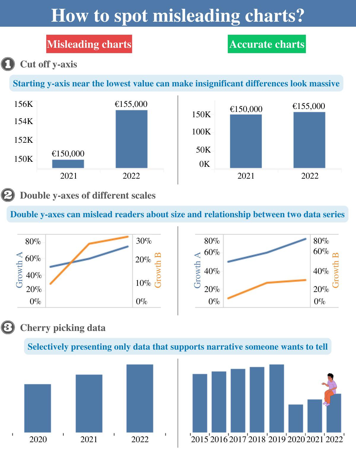
 [OC] How to spot misleading charts? I would like to hear your opinion on the subject, also any tips design-wise?
spiral8888 t1_izfsxmw wrote
Reply to comment by IONIXU22 in [OC] How to spot misleading charts? I would like to hear your opinion on the subject, also any tips design-wise? by dark_o3
The problem is that in some plotting programs that's the default. That's why it's hard to know if the journalist presenting the graph is deliberately trying to mislead or is just incompetent and doesn't understand that if he/she doesn't tell the plotting program not to suppress zero, the graph will be misleading.
Thundorius t1_izfwo9z wrote
Criminally negligent or just criminal.
Sines314 t1_izg0ojz wrote
Journalists should know this, it’s not complicated. Assume intent to mislead. Or that they’re too dumb to be doing their job.
ConstantinSpecter t1_izg8lot wrote
Halon’s Razor would like a word.
“Never attribute to malice that which can be adequately explained by stupidity.”
Historical_Shop_3315 t1_izivcm7 wrote
But my article is more convincing if the difference looks bigger.....i feel like the difference is this big...
Strength-Speed t1_izkbn73 wrote
I wonder if there is room for some journalism exam that requires passage. How to properly display data, etc. It wouldn't have to be exceptionally complicated but I think there are zero entrance requirements to being a journalist. At least you could say 'certified' or some such. Maybe there is qualification exam out there I don't know of.
Sines314 t1_izkpz2h wrote
I think we need less official credentials, really. No reason why hair dressers need a license. But newspapers shouldn’t hire journalist, people who deal in fact finding, if they are easily deceived.
Korwinga t1_izh2wb7 wrote
Not every graph needs to start at 0 though. A graph of temperature, for example, shouldn't ever start at 0 K unless you're dealing with temps in that range.
spiral8888 t1_izi9gkc wrote
I agree that there are a few exceptions, temperature being one of them. However, most misuse of suppressed zero is not with these quantities.
mick4state t1_izjz9hm wrote
I think there are good reasons to cut a y axis short, but you have to know your audience. If there are small differences, but you want to draw attention to those differences, it can make sense. I've done it in academic papers before, comparing scores in one group around 80% and scores in the other group around 87%. Statistically significant, but the full-scaled graph just doesn't present that information clearly. Scientists can handle looking at the y axis to check, but your everyday person likely won't.
Andoverian t1_iziusmb wrote
Maybe it's not always intentional, but as journalists they have an obligation to do it right.
Viewing a single comment thread. View all comments