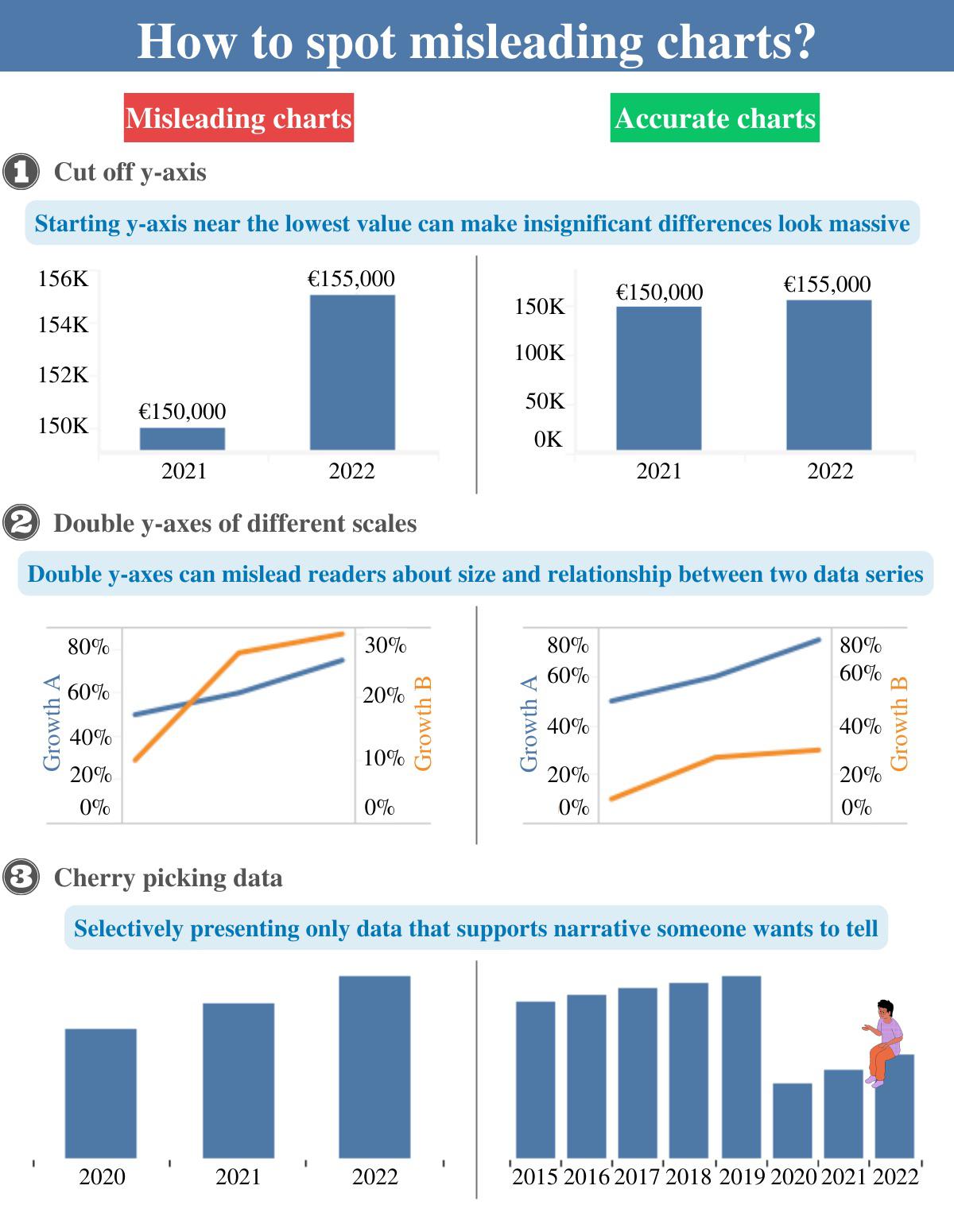
[OC] How to spot misleading charts? I would like to hear your opinion on the subject, also any tips design-wise? Submitted by dark_o3 t3_zg7pck on December 8, 2022 at 6:51 PM in dataisbeautiful 174 comments 3,858
zestyping t1_izg5v96 wrote on December 8, 2022 at 9:31 PM This recent r/dataisbeautiful post is an excellent example of misleading data visualization: https://old.reddit.com/r/dataisbeautiful/comments/z8tl1f/oc_ever_wondered_which_are_the_top_20_biggest/ See this comment for explanation: https://old.reddit.com/r/dataisbeautiful/comments/z8tl1f/oc_ever_wondered_which_are_the_top_20_biggest/iyd5goo/ Permalink 8 Mattie725 t1_izgfn68 wrote on December 8, 2022 at 10:38 PM Haha did they scale the height and totally ignore the massive surface increase? Permalink Parent 7 MrMitchWeaver t1_izhonye wrote on December 9, 2022 at 4:27 AM That's not even misleading, that's a first-year graphic designer who smoked crack with a 14-year-old day trader and decided to make charts. Permalink Parent 2
Mattie725 t1_izgfn68 wrote on December 8, 2022 at 10:38 PM Haha did they scale the height and totally ignore the massive surface increase? Permalink Parent 7
MrMitchWeaver t1_izhonye wrote on December 9, 2022 at 4:27 AM That's not even misleading, that's a first-year graphic designer who smoked crack with a 14-year-old day trader and decided to make charts. Permalink Parent 2
Viewing a single comment thread. View all comments