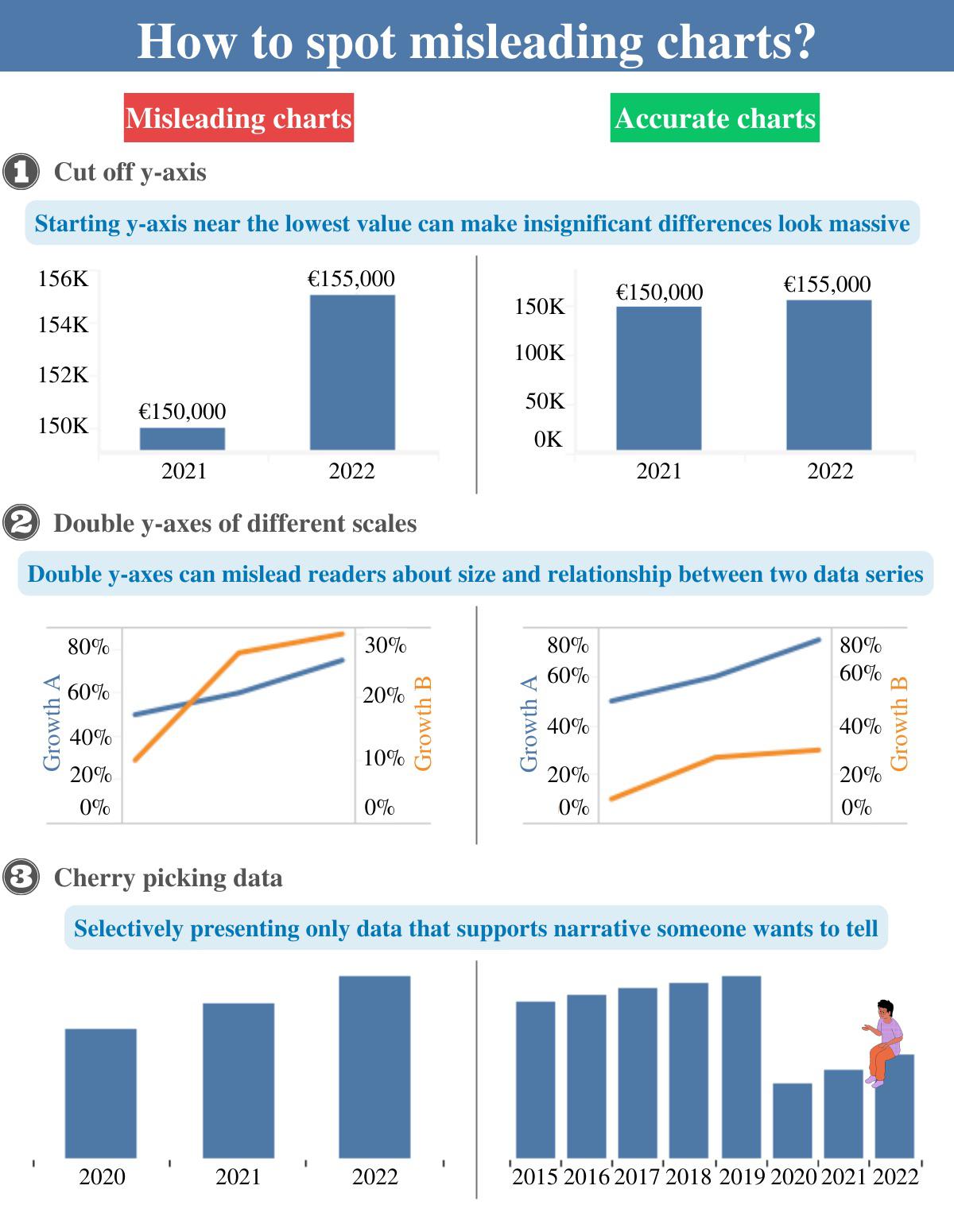
 [OC] How to spot misleading charts? I would like to hear your opinion on the subject, also any tips design-wise?
marsman t1_izj00gg wrote
Reply to comment by MrMitchWeaver in [OC] How to spot misleading charts? I would like to hear your opinion on the subject, also any tips design-wise? by dark_o3
>These are all expressed in percentage points but they have wildly different ranges and magnitudes. It would make no sense to use one single axis for two or more of those.
And importantly, there is the potential for trends to be highlighted by that sort of chart that wouldn't otherwise be visible, and that are accurately reflected in the data (so its not a manipulation).
Viewing a single comment thread. View all comments