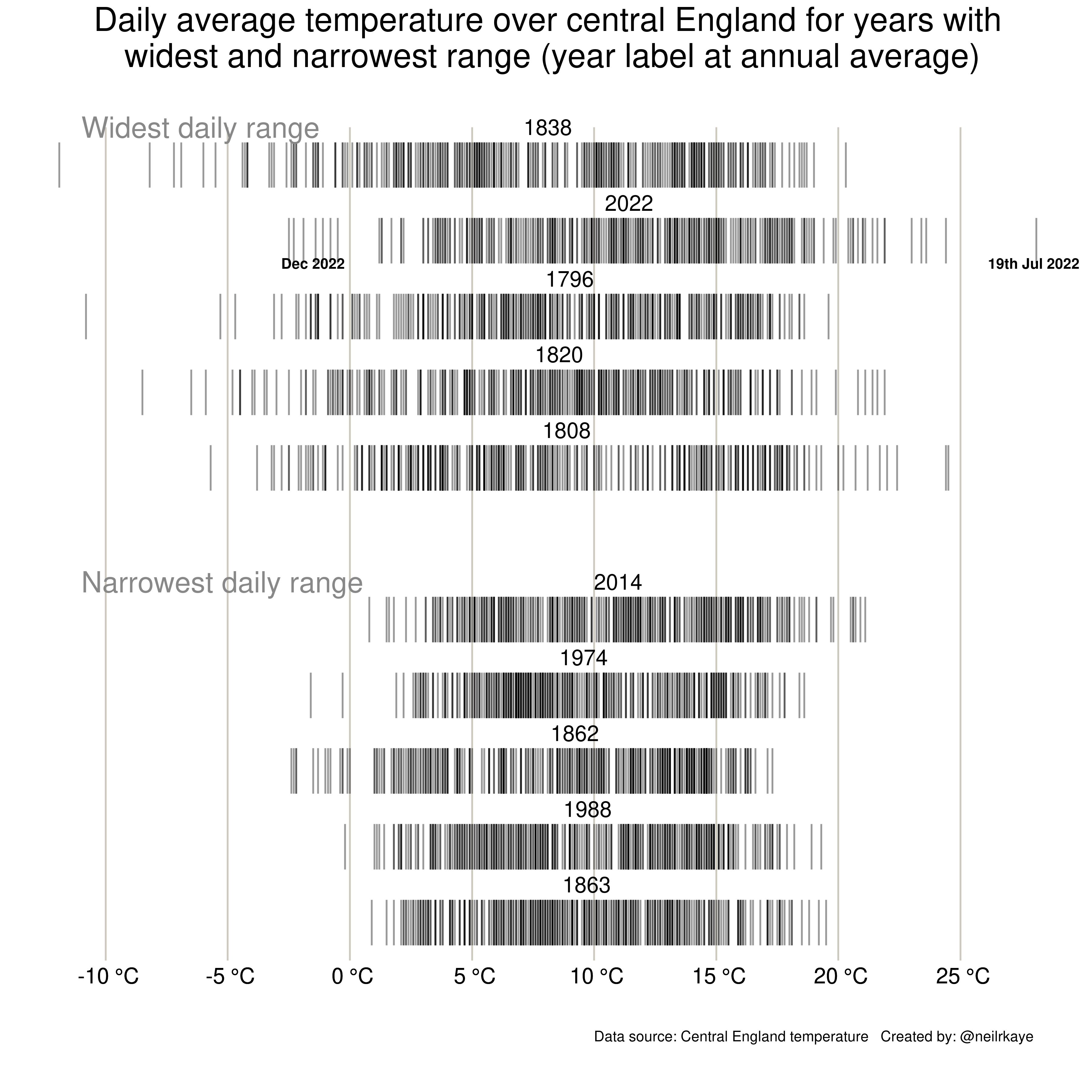
 So far 2022 has had the second widest range of daily average temperatures in the Central England temperature series. This shows the 5 years with the widest and narrowest range of temperatures in the series from 1772. [OC]
neilrkaye OP t1_j0g263m wrote
Created using ggplot in R using the CET temperature series from here:
https://www.metoffice.gov.uk/hadobs/hadcet/data/meantemp_daily_totals.txt
brynnafidska t1_j0gom5p wrote
I like. Could you add an average of all years’ ranges in the middle as a comparison?
punaisetpimpulat t1_j0js2xf wrote
That’s a very odd way of plotting this data. Obviously, you must have tried geom_boxplot, geom_violin or even geom_histogram first. What kind of exotic problems did you discover while trying all the sensible options?
Viewing a single comment thread. View all comments