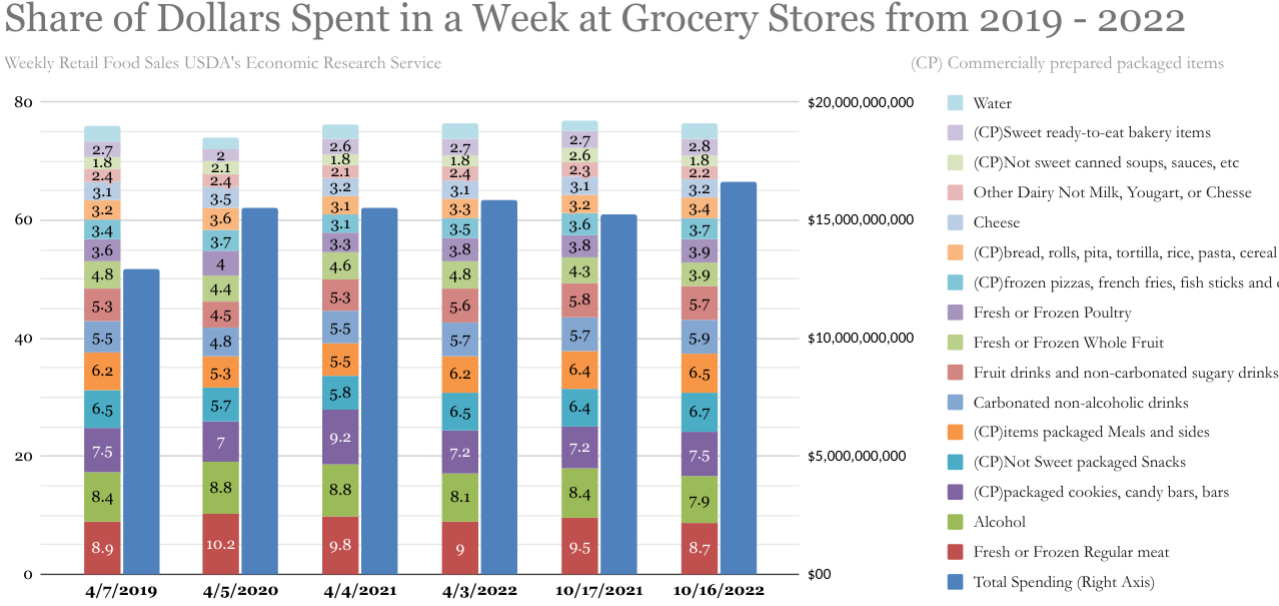
 [OC] What Impact has Covid and Inflation had on Grocery Shopping Trends in the US from 2019 - 2022
groovycoyote t1_j15qbyx wrote
Reply to comment by semideclared in [OC] What Impact has Covid and Inflation had on Grocery Shopping Trends in the US from 2019 - 2022 by semideclared
Then that is your takeaway. There is absolutely no need to use so much text and color. Choose a few key categories that are a good representation of people's overall shopping habits and add those as your colored lines. You can add another line with a neutral color combining all the rest and show the average values over time. Drop all the numbers from the chart and add a subtitle that says how nothing has changed despite this and that. And please use a logical order for the dates on the X axis.
semideclared OP t1_j15s623 wrote
Thats the week beginning Sunday of each year
semideclared OP t1_j15t41h wrote
IF you use Beef, Beer, Cokes, Stouffer Frozen Food, Crackers, and Oreo's, well that only 50% and people just think youre being to selective to make fun of American Diets
Viewing a single comment thread. View all comments