 [OC] Data visualizations on r/dataisbeautiful based on the top 100 upvoted posts of 2022
Submitted by Metalytiq t3_1038snt in dataisbeautiful
Metalytiq OP t1_j2xgh83 wrote
Data source: Reddit - r/dataisbeautiful top 100 posts
Tool: Tableau
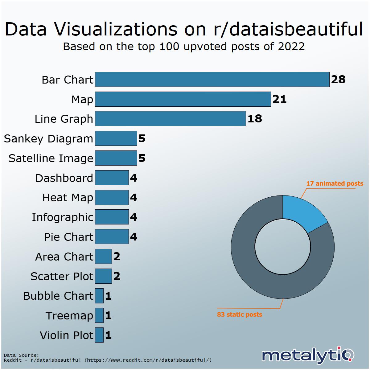
The widely popular subreddit r/dataisbeautiful has been a source of inspiration and ideas for data visualization fans and enthusiasts for years. We decided to take a look at what were the most common types of data visualizations within the top 100 upvoted posts of 2022.
Key takeaways:
Bar charts, maps, and line graphs make up 67% of the top 100 posts in 2022.
Animated graphs make up 17% of the top 100
In the top 100, Redditors u/jcceagle had 7 posts, u/latinometrics had 6 posts, and u/giteam had 5 posts
**Pie Charts include one donut chart and one sunburst chart
**Bar Charts include three stacked bar charts and one lollipop chart
**Map includes point maps, space distribution, line maps
Viewing a single comment thread. View all comments