 2012 Olympic male athletes’ weight [OC]
Submitted by highcharts t3_107908x in dataisbeautiful
highcharts OP t1_j3l3sug wrote
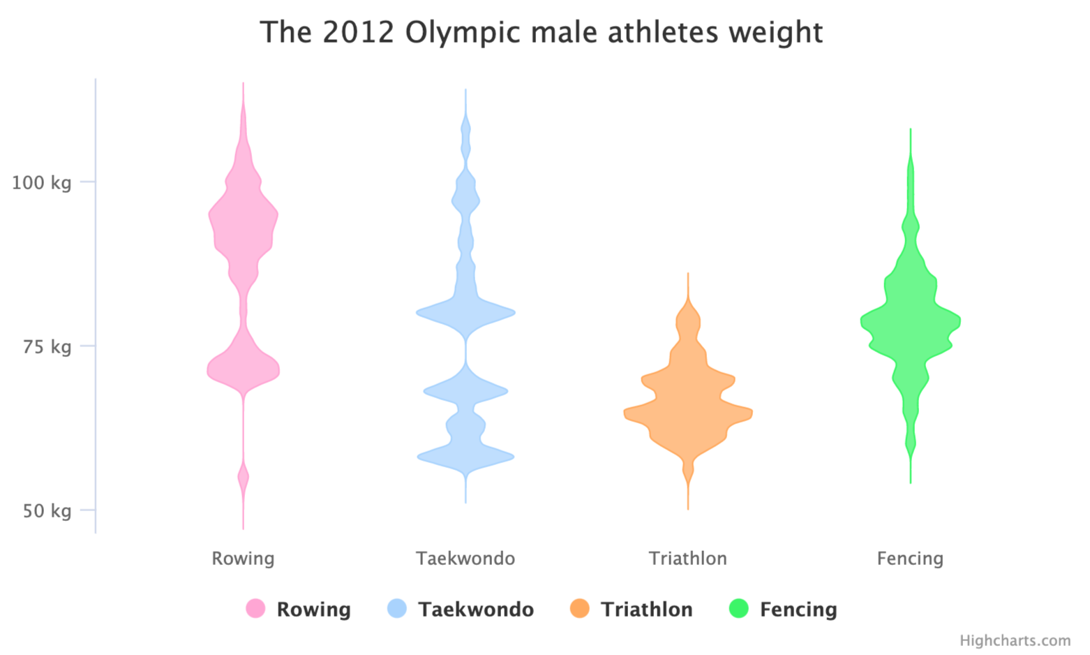
A violin plot displays the 2012 Olympic male athletes’ weight of the following disciplines: taekwondo, rowing, triathlon, and fencing. The violin plot visualizes the distribution shape and the probability density (athletes’ weight) across each discipline compellingly and intuitively. Link to data, tool used Highcharts, and source topendsport. Check more about the subject in violin plot
colinmasterson t1_j3n9tmo wrote
This is great. I learned something new. Thank you
sh545 t1_j3qpdzk wrote
It seems like it is self reported weight rather than their actual weight, that might explain the peaks on triathlon, athletes could be rounding their weight to a nicer number , e.g. reporting 80 instead of 81.5, or 75 instead of 73.9. Do those ‘peaks’ in triathlon actually correspond to round numbers?
EpitomEngineer t1_j3teyuj wrote
Your question provides a good reason not to use this visualization.
Viewing a single comment thread. View all comments