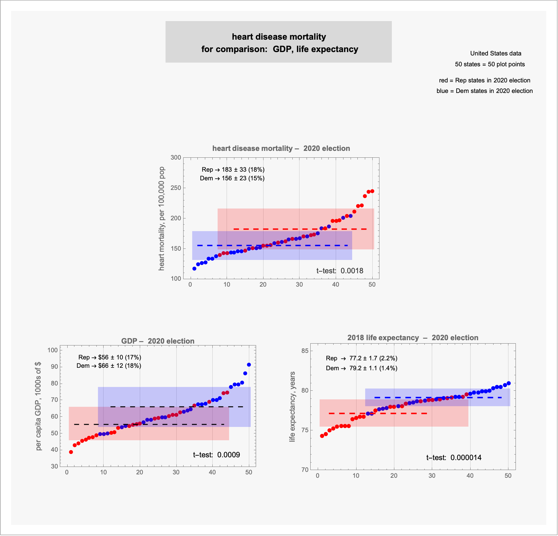
 [OC] heart disease mortality, with GDP and life expectancy –– 2020 election
Submitted by terrykrohe t3_10go1zc in dataisbeautiful
Artistic-Breadfruit9 t1_j55xsy9 wrote
I'm not a fan of how these are plotted.
This could have three bar plots, with "Red States" and "Blue States" on the X-axis (y-axes the same). Error bars to indicate the variability across red or blue states. Actually, it would have been even better at the level of congressional districts, but I don't know if those data are readily available.
Also, Mann-Whitney U-Test instead of a t-test (unless you can demonstrate a normal distribution).
Viewing a single comment thread. View all comments