 Violent Crime Rates of Massachusetts Municipalities (2020) (OC) (re-upload based on constructive criticism)
slib9898 t1_j25dz30 wrote
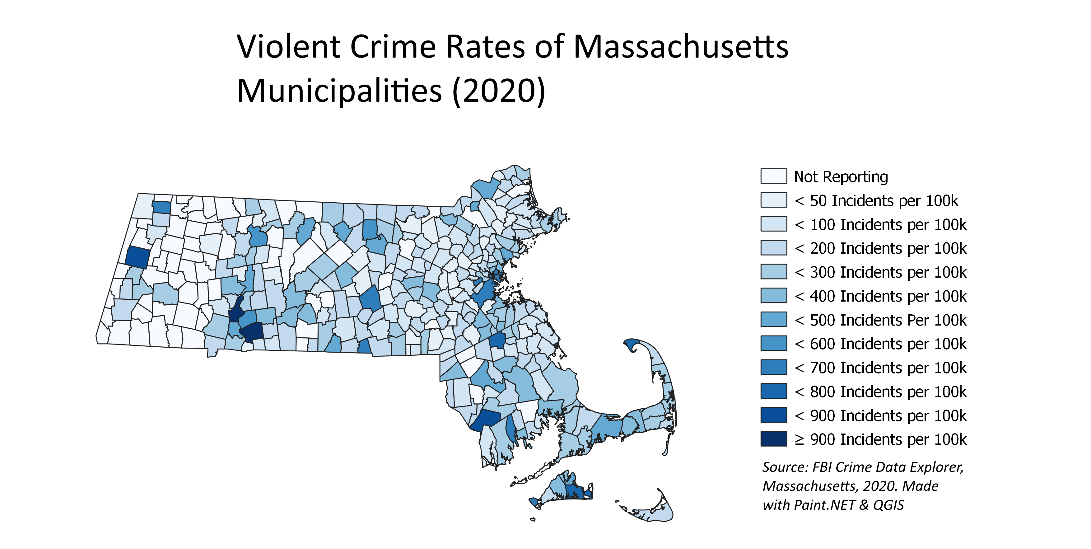
Reply to comment by potkea in Violent Crime Rates of Massachusetts Municipalities (2020) (OC) (re-upload based on constructive criticism) by potkea
I think there is still a similar issue. not to say these maps you made aren't good. thank you so much for them, OP!
I also have some trouble differentiating. it would look a lot uglier, but maybe making each color entirely different would help, but then you lose the benefit of being able to look at the map as a whole and seeing clusters of counties/ cities with crime
heklakatla t1_j25j85t wrote
/u/potkea - It's the gradient.... There are too many steps with colors that are too similar. If you poke around /r/dataisbeautiful for a period of time you'll see some constructive feedback in and around that area.
potkea OP t1_j25upuj wrote
Ok. Thank you.
DawctorDawgs t1_j26lwaw wrote
Hey potkea! Id potentially make the data into fewer cuts, which would eliminate the number of shades & simplify this overall…maybe 250/500/750/+.
What you’re really drawing attention to is outliers, and they’ll remain as such even with fewer cuts. You can also put the “incidents per 100K” somewhere ONCE - no need for it written out each time. With newfound space (or maybe even without), blow the map up larger, and maybe add a few labels somehow, calling out major cities (small, potentially unnecessary idea tbh), but could be helpful to orient.
Previous_Pension_571 t1_j2a7wt1 wrote
The point of the map isn’t to see and match individual colors it’s to see trends across the state.
Viewing a single comment thread. View all comments