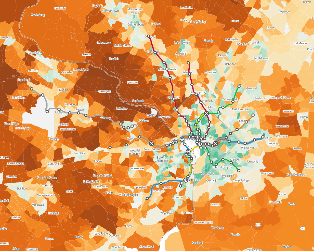
How transit affects emissions: A map of average household CO2 emissions, with Metrorail routes added Submitted by Golden_Kumquat t3_zluhb8 on December 14, 2022 at 3:51 PM in washingtondc 65 comments 284
Golden_Kumquat OP t1_j076zrs wrote on December 14, 2022 at 3:53 PM Data comes from The New York Times; green is fewer emissions. Unfortunately the color scheme isn't the greatest when dealing with a transit system with green and orange lines, but at least the stations should be recoginisible enough. Permalink 64 [deleted] t1_j07jqxf wrote on December 14, 2022 at 5:16 PM [deleted] Permalink Parent 37 Golden_Kumquat OP t1_j07ljuk wrote on December 14, 2022 at 5:28 PM My first lesson was to change the map projection because the default QGIS one looks rather squished. Permalink Parent 17 UnoStronzo t1_j08s1ri wrote on December 14, 2022 at 9:55 PM Amazing! I saw the NYT map yesterday. Smart of you to overlay the metro network Permalink Parent 7
[deleted] t1_j07jqxf wrote on December 14, 2022 at 5:16 PM [deleted] Permalink Parent 37 Golden_Kumquat OP t1_j07ljuk wrote on December 14, 2022 at 5:28 PM My first lesson was to change the map projection because the default QGIS one looks rather squished. Permalink Parent 17
Golden_Kumquat OP t1_j07ljuk wrote on December 14, 2022 at 5:28 PM My first lesson was to change the map projection because the default QGIS one looks rather squished. Permalink Parent 17
UnoStronzo t1_j08s1ri wrote on December 14, 2022 at 9:55 PM Amazing! I saw the NYT map yesterday. Smart of you to overlay the metro network Permalink Parent 7
Viewing a single comment thread. View all comments