OfficialWireGrind
OfficialWireGrind OP t1_ixwkzkh wrote
The plot shows duration in minutes, total word count, and words per minute for a selection of 15 songs. The plot is done in the style of a topographic map, but with words per minute instead of elevation. The song selection is Spotify's top-5 most streamed songs for the years 2019, 2020, and 2021.
Sources: genius.com, azlyrics.com, musixmatch.com, en.wikipedia.org
Tools: Python, Matplotlib
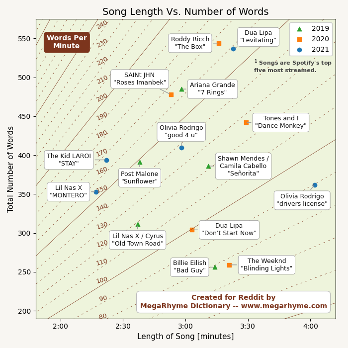 [OC] Words Per Minute in Songs Plotted as a Topographic Map
Submitted by OfficialWireGrind t3_z5ks0s in dataisbeautiful
OfficialWireGrind OP t1_ixj5et4 wrote
Reply to comment by Old_Cheesecake_5481 in [OC] Words That Are Used More Often In 2022 by OfficialWireGrind
"Groomers" was not included in the chart due to it having lower overall usage. Your perceptions appear consistent with my results though:
- groomers: +314.7%
OfficialWireGrind OP t1_ixj3r87 wrote
Reply to comment by RevolutionaryTone276 in [OC] Words That Are Used More Often In 2022 by OfficialWireGrind
It is in the works.
OfficialWireGrind OP t1_ixgb1q6 wrote
Reply to comment by Karnezar in [OC] Words That Are Used More Often In 2022 by OfficialWireGrind
Yes, well both "Democrats" and "Republicans" had similar increases (49% vs. 53%). However, total usage volume for both words was marginal, and only one of the words had a volume high enough to make the chart.
OfficialWireGrind OP t1_ixflt7n wrote
Reply to comment by chesterforbes in [OC] Words That Are Used More Often In 2022 by OfficialWireGrind
These words were used very heavily, however, the amount of usage did not change significantly.
OfficialWireGrind OP t1_ixfhfi1 wrote
Reply to comment by gameboy1001 in [OC] Words That Are Used More Often In 2022 by OfficialWireGrind
+999.4254515948546%
OfficialWireGrind OP t1_ixfedj8 wrote
Reply to comment by Ebiig in [OC] Words That Are Used More Often In 2022 by OfficialWireGrind
It is entirely English language and social media type data.
OfficialWireGrind OP t1_ixfabzs wrote
Reply to comment by DJCPhyr in [OC] Words That Are Used More Often In 2022 by OfficialWireGrind
For the record
- dog: +10.5%
Also,
- cat: +9.8%
- positive: +11.4%
- safety: +11.4%
EDIT:
- puppies: +2.4%
OfficialWireGrind OP t1_ixf7vfe wrote
The bar chart shows how word usage in 2022 compares with that in 2021. Word frequency counts were made using Reddit comment datasets from Pushshift. All posts were made during June of 2022 and June of 2021. Each percentage indicates the change in a word's absolute count (after adjusting counts to reflect datasets of slightly difference sizes). The bar chart was made with Python and Matplotlib.
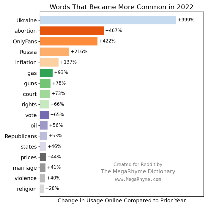 [OC] Words That Are Used More Often In 2022
Submitted by OfficialWireGrind t3_z29e9t in dataisbeautiful
OfficialWireGrind OP t1_ixwp1xq wrote
Reply to comment by thedean246 in [OC] Words Per Minute in Songs Plotted as a Topographic Map by OfficialWireGrind
My initial impression about this is that it's heavily effected by the number of times the hook, chorus, etc is repeated.