I am not implying a negative correlation. The plot looks like a 'lower left triangle' not like a line with a negative slope. I am just saying that 'upper right triangle' is mostly empty.
Yeah it's definitely not perfect, doesn't account for income inequality at all. If you have a suggestion for a better metric (data for which is available publicly) let me know, I will share another plot using that. Would be interesting to compare it with this one.
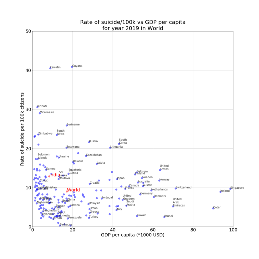 [OC] Suicide Rate vs GDP per capita for various countries. Notice that the upper right triangle is almost empty i.e. generally increase in GDP per capita results in decrease in suicide rates.
ankuprk OP t1_isdhzt3 wrote
Reply to comment by TotallynottheCCP in [OC] Suicide Rate vs GDP per capita for various countries. Notice that the upper right triangle is almost empty i.e. generally increase in GDP per capita results in decrease in suicide rates. by ankuprk
I am not implying a negative correlation. The plot looks like a 'lower left triangle' not like a line with a negative slope. I am just saying that 'upper right triangle' is mostly empty.